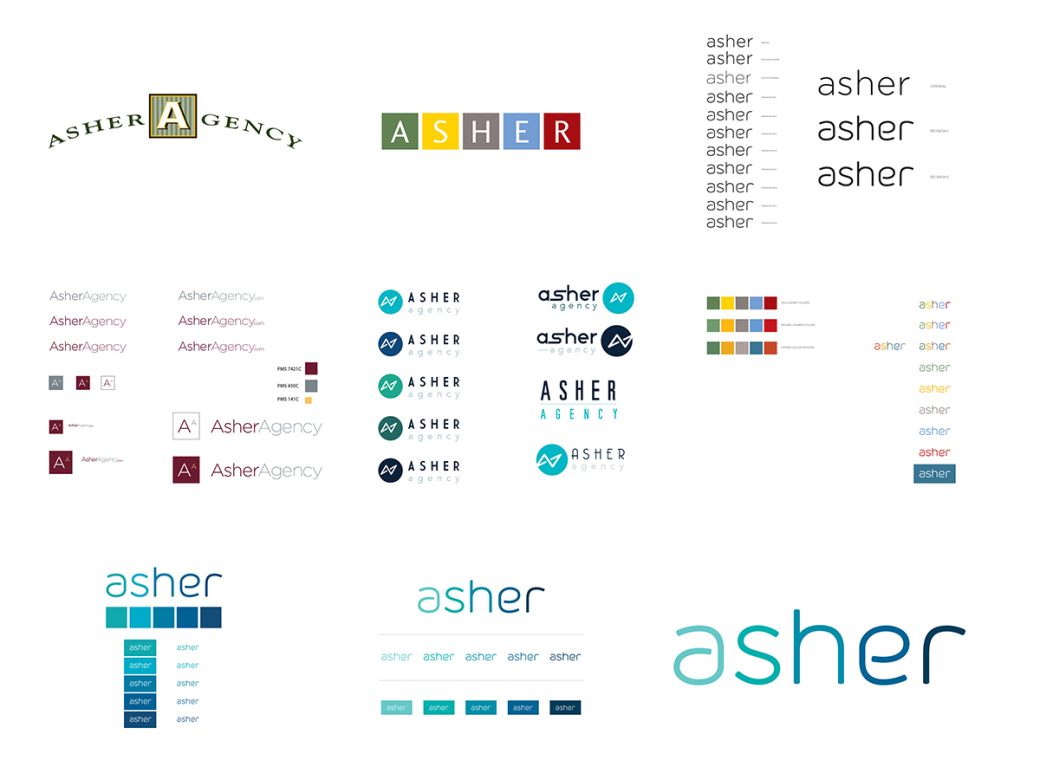
So when you’re pondering logo (re)designs, consider these 5 tips to help you stand out among the rest:
- Don’t rely on trends. Trend, by definition, means change. You shouldn’t have to worry about adjusting your logo when the seasons change. It should be able to stand the test of time.
- Avoid poor font choices. Simple, clean fonts are always better reads and more recognizable. That means staying away from Comic Sans and Curlz MT, and sidestepping beveling, embossing, and drop shadows.
- Don’t go overly detailed. It may look great on a large scale, but when logos get smaller they can lose a lot of features. It could become blurry or even look smudged and unreadable.
- Don’t do a complete overhaul. If you already have an established company, many consumers already relate you with your logo. Instead of compromising your established brand, alter it.
- Do your research. No good logo has been done ignoring how employees or consumers feel about your products and brand.
Not only are successful logos about good design, they also embody the business, the employees, and the customer base. Logos should have a significant connection to the culture of the business and be easily relatable to the values.
Own it. Embrace it. Personify it.
-Author: Heather Peaytt